 Skip to content

How to Choose the Right Color Vertical Blinds for Any Room
- by Giorgi Gogidze

Choosing the right color for your vertical blinds can make the difference between a room that feels cohesive and polished versus one that feels disjointed or incomplete. While functionality is crucial, the color of your window treatments plays a significant role in defining your space's aesthetic, influencing the room's mood, and either enhancing or detracting from your overall design scheme. With countless color options available in today's market, making the right choice can feel overwhelming, but understanding key principles will guide you toward the perfect selection for any room in your home.
[toc]
Understanding Color Psychology in Interior Design
Before diving into specific color recommendations, it's essential to understand how different colors affect mood and perception in interior spaces. Colors have psychological impacts that can influence how comfortable and energized you feel in a room. Cool colors like blues, greens, and grays tend to create calming, serene atmospheres that work well in bedrooms and bathrooms. Warm colors such as reds, oranges, and yellows can energize spaces and create cozy, inviting environments perfect for living rooms and dining areas.
Neutral colors including whites, beiges, and soft grays offer versatility and timelessness, allowing other design elements to take center stage while providing a sophisticated backdrop. Understanding these psychological effects helps you align your blind color choices with the intended function and mood of each room.
Assessing Your Room's Existing Elements
The foundation of choosing the right blind color lies in carefully evaluating your room's existing elements. Start by identifying your room's primary color palette, including wall colors, furniture finishes, flooring materials, and major decorative accessories. Your vertical blinds should either complement this existing palette or serve as a deliberate accent piece.
Consider the undertones in your current décor. Many seemingly neutral colors have warm or cool undertones that can clash with the wrong blind color. For example, a beige wall with yellow undertones may look muddy when paired with cool gray blinds, while it would harmonize beautifully with warm taupe or cream-colored blinds.
Examine your room's architectural features as well. Crown molding, baseboards, door frames, and window trim all contribute to the overall color story. Your blinds can either blend seamlessly with these elements or create intentional contrast for visual interest.
The Power of Neutral Colors
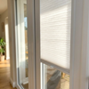
Neutral-colored vertical blinds remain the most popular choice for good reason. White, off-white, cream, beige, and light gray blinds offer incredible versatility and longevity. These colors work with virtually any décor style and color scheme, making them an excellent investment if you frequently redecorate or are unsure about long-term color commitments.
White vertical blinds create a clean, fresh appearance that can make rooms feel larger and brighter. They reflect natural light effectively, which is particularly beneficial in smaller spaces or rooms with limited natural light. However, pure white can sometimes feel stark or clinical, so consider softer alternatives like ivory or cream for a warmer approach.
Beige and taupe blinds provide warmth while maintaining neutrality. These colors work exceptionally well in traditional and transitional design schemes, offering a sophisticated backdrop that won't compete with other design elements. They're particularly effective in rooms with warm wood tones or earth-toned color palettes.
Gray has become increasingly popular in contemporary design, offering a modern neutral that pairs beautifully with both warm and cool color schemes. Light gray blinds can provide subtle contrast against white walls while remaining understated, while darker grays can create dramatic, sophisticated looks in the right setting.
Room-Specific Color Considerations
Living Rooms: As the primary gathering space in most homes, living rooms benefit from blind colors that create welcoming, comfortable atmospheres. Consider the room's primary function and the mood you want to establish. Warm neutrals like cream, soft beige, or warm gray work well in most living rooms, providing a sophisticated backdrop for furniture and artwork. If your living room features bold accent colors, neutral blinds prevent visual competition and maintain balance.
Bedrooms: Bedroom blind colors should promote relaxation and restful sleep. Soft, muted colors generally work best in these intimate spaces. Cool tones like pale blue, soft gray, or sage green can create serene environments conducive to rest. However, if your bedroom receives limited natural light, warmer neutrals might be more appropriate to prevent the space from feeling cold or unwelcoming.
Kitchens: Kitchen blinds need to withstand humidity, cooking odors, and frequent cleaning while maintaining their appearance. Practical considerations often favor lighter colors that show less dirt and are easier to maintain. White, cream, or light gray blinds work well in most kitchens, complementing both traditional and contemporary design schemes. Consider the color of your cabinets and countertops when making your selection.
Home Offices: Productivity and focus should influence blind color choices in work spaces. Colors that promote concentration without being distracting work best. Neutral colors like soft gray, beige, or off-white create professional atmospheres without overwhelming the space. Avoid overly stimulating colors that might interfere with work concentration.
Bathrooms: Moisture resistance and easy maintenance are crucial in bathroom window treatments. Light colors that resist showing water spots and soap residue are practical choices. Consider the color of your fixtures, tiles, and vanity when selecting blind colors. Cool neutrals often work well in bathrooms, creating spa-like atmospheres.
Working with Natural Light
The amount and quality of natural light in your room significantly impacts how blind colors will appear throughout the day. Rooms with abundant natural light can handle darker blind colors without feeling heavy or oppressive. Conversely, rooms with limited natural light benefit from lighter blind colors that reflect available light and brighten the space.
Consider the direction your windows face, as this affects the quality of light throughout the day. North-facing windows receive cooler, more consistent light that may make warm-colored blinds appear more appealing. South-facing windows receive warmer, more intense light that can make cool-colored blinds feel more comfortable.
Creating Visual Interest with Color
While neutral colors are safe choices, don't overlook opportunities to create visual interest with your blind selection. Subtle color variations can add depth and sophistication to your design scheme. Consider blinds in colors that are one or two shades lighter or darker than your wall color for gentle contrast that adds dimension without creating jarring transitions.
For those wanting more dramatic impact, colored vertical blinds can serve as accent pieces. Deep blues, rich greens, or warm burgundies can create focal points and add personality to neutral rooms. However, bold blind colors require careful consideration of the room's overall color balance and your long-term design plans.
Practical Maintenance Considerations
Color choice also impacts the practical aspects of blind maintenance. Darker colors tend to show dust, pet hair, and water spots more readily than lighter colors. If you have pets, small children, or live in a dusty environment, lighter colors may be more forgiving and require less frequent cleaning.
Consider the blind material as well, as different materials hold and show colors differently. Fabric blinds may fade over time, particularly in rooms with intense sunlight, while vinyl and aluminum blinds typically maintain their color better with proper care.
Coordinating with Future Design Changes
When selecting blind colors, consider your long-term decorating plans. If you frequently change your décor or are planning major renovations, neutral blind colors provide flexibility for future design changes. However, if you're committed to a specific color scheme for the long term, you can be more adventurous with your blind color choices.
Conclusion
Choosing the right color vertical blinds requires balancing aesthetic preferences with practical considerations, room function, and existing design elements. While neutral colors offer the greatest versatility and longevity, don't be afraid to explore subtle color variations that can add depth and interest to your spaces. Consider each room's unique characteristics, natural light conditions, and intended atmosphere when making your selection.
Remember that your vertical blinds will be a prominent feature in your room for years to come, so take time to evaluate your options carefully. When in doubt, neutral colors provide a sophisticated foundation that can adapt to changing décor trends and personal preferences. The right blind color choice will enhance your room's beauty while providing the functionality you need for comfortable, stylish living.


